
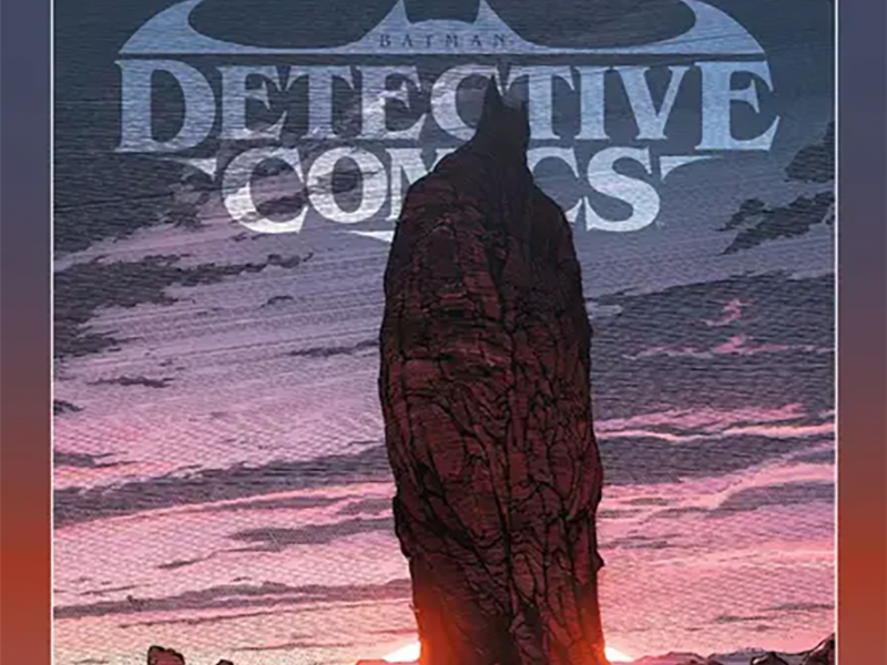
Forgotten But Not Gone: Reviewing ‘Detective Comics’ #1080
by Scott Redmond
Overview
As the intermezzo comes to an end, ‘Detective Comics’ #1080 pulls no punches in setting up the fate of Batman and all his allies as it primes us for the third act of this gothic opera. There is no question as to why this is one of the best series being published today, fulling understanding who and what the characters involved can and should be.
Overall
10/10Sometimes, no matter how intricately planned a heist might be, the only avenue to success is a well-played wild card. That element which turns the tide but cannot be accurately predicted. Bonus points if said wild card tends to be walking talking chaos incarnate.

Catwoman’s Batman saving plan needs that wild card in Detective Comics #1080, the final chapter of the Batman: Outlaw arc from Ram V, Jason Shawn Alexander, Mike Perkins, Dave Stewart, and Ariana Maher. It’s paired with a backup story from Dan Watters, Christopher Mitten, Triona Farrell, and Steve Wands.
After all the intrigue, sleight of hand, and manipulation, Catwoman and her prize of the almost-killed Batman are almost at the finish line. A master of his craft, Ram V played every single card with confidence and deep-seated knowledge. Even the most obvious of reveals has felt like a shocking revelation because of the well-paced buildup. This allows for the true wildcard moments such as the re-introduction of the chaos that is Two-Face, after the character seemingly exited the story months ago.
The same goes for the reveal and fate of poor Arzen Orgham. Just another element that is not shocking in the sense that we could not see it coming, but because of the path taken to get here. As a writer, he keeps us off guard and puts all the pieces in plain sight. Things are so deep and given so much presence that it’s easy for us to miss them and not put them together correctly until he’s ready to show us. Every moment, character, and beat is part of this carefully orchestrated Gothic Opera. Ready to dip and dodge out of the way as needed, continuing to show love for how rich this character’s universe truly is.

A frantic escape and a family confrontation are the heart of the story here, and we feel every bite of them thanks to Alexander and Perkins.
While there are clear differences in the two’s artwork, they share enough qualities and stylistic choices that it flows. Sharp, rough punches are dropped by the art, making every moment dig deep as it hits us. Even as the heroes have a small victory, their foes are digging deeper and showing why they might be primed to actually win (even though we know they of course won’t). On both sides sacrifices are made, but the level of sacrifice speaks to commitment versus love.
This is delivered with each panel and page. Panels that shift and change in shape and focus at the drop of a dime, pulling us deeper into the moment. Letting emotions wash over the reader in an unending and often unexpected way. These moments cut deep into the world and just a glance shows that sharp side, pulling at the darkness and making it ever-present.
Stewart plays upon this with the heavier use of shadows in the colors. Little pops here or there of brighter colors remind us that this is taking place in a fantastical world. All of it is weighed down though by how dark the world already was and how much darker it becomes as the Orghams keep winning. Weaving that all into the artwork is something Stewart seems to do effortlessly, letting us feel little gasps of hope even as the darkness consumes more and more.

We’re regaled through this tale by the narration captions of Catwoman and the stories that Dariah Orgham tells to her son. Maher is masterful at making sure it all flows, capturing the right emotions and punctuation of delivery. Even the pages where there are far more words never feel overwhelming, instead they are enthralling. Each piece of emotional energy is clear and can be heard, letting the character’s voices form within our minds. Seemingly small changes, to fonts or bubbles, change the delivery dramatically.
Oh the choice to have the narration shift at the end to black font with white outlines like prose upon the page, no bubbles or boxes, was brilliant. That epilogue of sorts showcasing Talia/Batman’s travel and the fallout of Gotham in the weeks to come, both tell and show us so much in just a handful of pages. It captures a feeling while also allowing the team to move the story ahead without spending a whole other issue or more pages to do so.
Also, the fact that we’re about to get even more Renee Montoya/Question…that sound you heard was my excited shouts. This is the stuff.

It’s a treat each issue to see what character or moment Watters will focus on for the backups. This time it’s a Damian Wayne nightmare focused on the story his mother told him. A story about the Grim Soldier Farhad, which was referenced early in the run.
Mitten is the perfect artist for this as the artwork we’ve presented is so trippy and gorgeous, really feeling like a dream sequence. Things blend, panels are not really a thing in many spaces, because the story is bigger than the confines of a comic page. Everything has that same roughness of the main story, with heavy dark colors as well.
Pops of brightness, chiefly like reds and yellows, are provided thanks to Farrell. Who blends the darker and the lighter into something that is quite a sight to behold. Even the final night scenes feel eerily accurate, the blues and purples of the lighting speaking to how rooms are lit at night with the curtains open and the moon fully above.

Watters has such a keen storytelling sense. Choosing to tell this story in a way that is a mix of what is almost prose and comic book images. We get beats of dialogue from Damian and a few of those he sees in the dream, but most are told to us through the images and the narration boxes. It’s fully connected to what we know of the overall series direction while doing something on its own.
Wands makes those boxes and bits of dialogue stand out, and work. Aiming to allow the boxes to flow around organically, often framing the artwork, never taking over, or standing in the way. A precise font choice makes it feel like a journal or story being written. Pure straight words of story against the backdrop of fear-inducing imagery is such a powerful combination.
Detective Comics #1080 is now available from DC Comics.
