
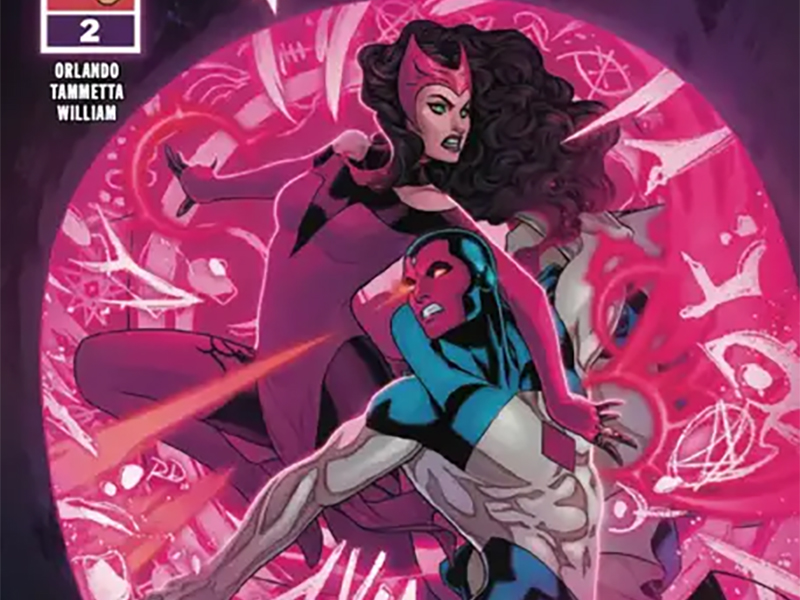
A Twin Thing: Reviewing ‘Scarlet Witch & Quicksilver’ #2
by Scott Redmond
Overview
Motivated parties continue their assault against the Maximoff twins, as some expected allies join the fray in Scarlet Witch & Quicksilver #2. A visually pleasing issue is mostly fine on other accounts, with the overall writing trying to do a bit more than is neccesary.
Overall
8/10Divide and conquer is a very sound strategy. Especially if your targets happen to be an extremely powerful twin duo.

Far from powerless, the Maximoffs strike back in Scarlet Witch & Quicksilver #2 from Steve Orlando, Lorenzo Tammetta, Frank William, and Joe Caramagna.
Much like the title protagonists, I’m of two minds about this issue.
Let’s start with the more positive side, for a change of pace.
I loved seeing both of these heroes working to the fullest of their abilities. Just a great showcase of what they can do, and who they are. As much of a jerk as he is, I enjoy stories with Quicksilver. Especially when he’s shown to be more than just “the fast guy.” Quick and logical thinking goes well with quick feet and hands.

Orlando has written Wanda so well since kicking off her new solo adventures. He slides Pietro into that dynamic so smoothly. Even apart, we can feel their shared energy, knowing eventually it will lead them back together. Both of them turning to someone else they are connected with for help adds to this dynamic. It’s especially nice to get some time with Speed, the oft-forgotten poorly used Maximoff family member.
The Wizard’s new mindset (embracing the magical side of the universe) and the Frightful Four Hundred are fun wrinkles. It’s a clever way to use a classic character but in a way which feels naturally fresh. As well as incorporating a lot of elements (chiefly tech) that are part of the universe into new spheres (hello body slides).
Unfortunately, now comes the downside, which is connected to everything I just said.

This comic is so talky.
I know, that’s rich coming from a guy whose reviews often tend to be quite hefty. The difference is, I work in a medium made up of words rather than words and visuals. Whether it’s the captions or the dialogue, it feels like this comic is talking at us every single chance it gets. A blow-by-blow retelling of what is happening on the page. Characters just vomiting words at us in a prolific fashion.
What Tammetta is putting on the page is gorgeous and inspiring. So rich with detail, emotions that are clearer than clear, and a solid weight to everything that makes the world feel fully realized. That’s’ why all the words feel superfluous. Each panel and moment tell us so much, all that we need to know in many cases. A few additional words or a thought caption would do the rest of the work the panels might not.
Instead, the words are trying to do the work for the visuals.

At a glance, I feel like Tammetta’s already stellar artwork from the preceding Scarlet Witch series somehow got even more dynamic with this series. Hitting those perfect center vibes where it has a really fantastical whimsical animated tone mixed with a heavy realistic grounded vibe. Putting those together gives you some of the best comics, where serious and fun are a steady couple rather than distant strangers.
Oh, and it’s a truly colorful delight to behold. So many really striking vibrant colors scattered, with purpose, across the pages. William doesn’t hold back when it comes to many of the color choices, as the Frightful Four Hundred are just so (perfectly) aggressively pink as just one example. Balancing it all out though is how the setting pieces (like Lotkill) are where things take a step back color wise.
More natural colors that make the small town feel authentic. Giving us that real place in this fantastical world vibe that is what Marvel prides themselves upon.
Since I mentioned how loquacious this comic tends to be, that means there is plenty to do on the lettering side.

Per usual, it’s done splendidly by Caramagna. Despite there being a flood of words, visually it never consumes the page in any way (which sounds funny after my original comments). Yes, there are too many words, but they are orderly and well put together, which helps a lot. Easily some of the bits could have ended up being mile long bubbles that took up half the page, but Caramagna makes sure this doesn’t happen.
Beyond the words placement are all the great visual flairs. Bigger explosive font sizes, colorful strokes to bubbles, SFX that are energetic, and so much more. Just like the rest of the visuals, they are a wonderful treat to gaze upon.
Scarlet Witch & Quicksilver #2 is now available from Marvel Comics.
