
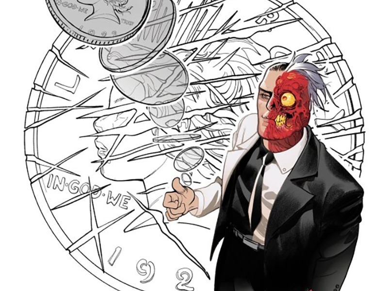
They Are The Law! — Reviewing ‘Two-Face’ #1
by Scott Redmond
Overview
Law and order are such nebulous concepts, especially in various societies, and Gotham’s worst try and maintain their own in Two-Face #1. Visually perfect with the right levels of darkness mixed within a solid legal drama, providing the best first ever solo debut a character could ask for.
Overall
10/10Hear ye, hear ye, the court is now in session. The court in question being the White Church of Gotham City’s criminal underworld, overseen by the Dishonorable Judge Reaper and former District Attorney Harvey Dent, otherwise known as Two-Face.

Murder is on the docket as the Batman foe of two minds finally flies solo in Two-Face #1. A stupendous debut issue comes from Christian Ward, Fábio Veras, Ivan Plascencia, and Hassan Otsmane-Elhaou.
First impressions are a key factor in any sort of situation. How they color our opinions and thoughts on a subject could make or break any potential relationship. While implicitly true with other human beings, the concept spreads far and wide into realms such as media as well. The right kind of first issue will hook a reader and leave them salivating for more.
By that metric, this creative team has made more than a successful first impression.

Let us talk about the cornucopia of delicious art that fills these pages.
Before now, I was not familiar with the artwork of Veras. That crime must be rectified, because hot damn, this is some good stuff. Within the first handful of pages, we’re graced with a surreal, yet grounded presentation of Two-Face’s origin story from the actual point-of-view perspective of Dent/Two-Face themself. Really detailed grounded moody pages follow, set within the courtroom, really nailing the procedural aesthetic.
The art nails two different vibes that intertwine in quick succession. That’s some great talent right there.

A heaviness permeates every page. It mixes well with the smoother and rougher textures at play. So many shadows are spread throughout, adding to the authentic lighting situation within the story as well as to the ominous mood.
Paneling choices dart between wider and closer, in order to maximize effect and really keep the viewer right in the middle of the action. It’s got the same energy of any courtroom drama, really honing in on the tension and the theatrics of the whole affair. There is plenty of depth and detail on display, especially in the scenes where there are so many people within the courtroom space.
Adding to the mood are the colors that Plascencia is playing with. They match the sort of smooth and rough touch of the rest of the artwork. This skews toward the more natural or even-toned quality colors, allows the spaces to feel authentic. With very worn down and standard spaces, this court exists in what appears to be old warehouses of Gotham. Lots of grays, browns, and blacks dominate the palette which, again, fits this story.
In various spots there are flashes of colors that are more vibrant or lighter, giving a little visual spice as well as adding to the variety of life.

Speaking of color, Otsmane-Elhaou goes wild with the colors and other visual dressings for the lettering. Two-Face comes with a built in space for letterers to really cut loose, with the two different voices and the various ways that the character(s) speak. Ragged rough balloons are used for Dent, and stark red harder ones are in play when we see Two-Face speaking. Other characters have just as much care put into their words, with modifiers and slight balloon changes giving them powerful voices.
Tons of words are flying around. The audience within the courtroom has plenty to say, too, none of it tripping over each other or feeling crowded. Dialogue is presented in the most logical readable way, framing everything else perfectly.
There is a really intriguing creative energy that always follows Otsmane-Elhaou, as his lettering style is out of this world. There is a reason he’s tapped for so many books, and comparison to his other DC Villains work like Poison Ivy shows the depth and lengths he can reach. The lettering feels similar in construction and slight style but so vastly different on every other front.
It tracks that the book is setup in a way to maximize the visual energy, since the writer happens to also be a very accomplished and talented artist as well.
I haven’t had a chance to read Ward’s Batman: City Of Madness yet, but I really want to. Either way, I knew I had to read this book just seeing his name attached but also the energy he put behind pushing it and describing the story. That description sold and delivered.

Harvey Dent is such an interesting character to see in a prolonged series light. He’s gone through some huge evolutions in the last few years, chiefly in the recently concluded Ram V led run of Detective Comics. In that run, the two sides of Dent had sort of come to a working relationship, that was tenuous at best. Here we see that it has fallen again, as Dent works hard to reclaim his life and potentially that which he lost so many years ago, when Two-Face was born.
I already spoke about the brilliant POV origin pages above, but they resonate even more once we see the full story. Like many other Batman rogues, Dent’s story is a tragic one. Someone that was essentially pushed into the dark side through life stuff, rather than being chaotic (Joker), murderous (Zsasz) or terroristic/world dominating (Ra’s Al Ghul).
The rapid fire nature of it makes the whole thing work. From the opening, to the theatrics, to how Dent solves the case and dispatches the guilty party, not a moment is wasted or spent idly. It reads like a breeze while also making sure to grace us with plenty of deeper character beats and development. Using Zsasz as the accused and delving into his methodology was a good choice, even if the man still makes me shudder with his creepiness.
Two-Face #1 is now available from DC Comics.


