
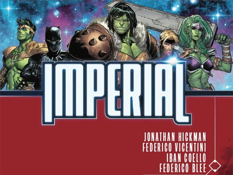
A Chessboard Built Upon The Stars — Reviewing ‘Imperial’ #1
by Scott Redmond
Overview
Grand in scale and execution with some of the more foundational beats somewhat in disarray describes this summer event line-wide relaunch debut perfectly. A solid attempt to bring the cosmic side of things back together. Time will tell how successful it can be, especially with so many discrepancies already appearing.
Overall
8/10Something is playing a deadly game with various galactic kingdoms and their rulers. A “game of thrones” if you will.
As the first few fall, a string of dominoes are tumbling in their wake leaving the remaining kingdoms with one course of action: war. The shots heard round the universe are fired in Imperial #1 from Johnathan Hickman, Iban Coello, Federico Vicentini, Federico Blee, and Cory Petit.

There’s a reason why that Game Of Thrones reference was made above. Having not watched anything but the pilot (was not my cup of tea), I can’t point to anything between these two that are actually the same. Instead, the reference is more to the idea that this series is from that same well of stories where various political kingdoms are vying for supremacy, tensions abound, and wars are fought.
In that sense, well this is very predictable and fits among many stories we’ve seen before. Just with Marvel alien kingdoms in the place of medieval fantasy ones.
Hickman is a writer that I swear by in most cases. Especially when he comes along to revamp particular corners of the Marvel Universe. The Krakoan era of the X-Men easily is one of my top favorite X-eras ever, and it’s doubtful that something will knock it off (any time soon at least).

Unfortunately, this didn’t have that same punch. Yes, I’m a mega X-Men fan so that was more in my wheelhouse, but Marvel Cosmic is something I love a lot too, especially because of the 2000s Annihilation event (referenced in this book). As well as all the books that rose from it, keeping the Guardians and Nova and others pretty much in continuous usage.
This issue is broken into chapters and they are full of political unrest, arguing, deaths, character back-and-forths, and plot advancement. Chapters are fine and work here, but the book starts to feel a little slogg-ish at times. Characters prepare to make revelations only to have those moments lead to death or the gasp moment quickly being moved past with new information.
It doesn’t help that this series seems to be ignoring a ton of Marvel continuity and character development — both from currently released cosmic-focused books and those in the recent past. Nova and Quill, who go back to the Annihilation war and were practically in a throuple recently, act like loose-connected colleagues. Quill is also seemingly totally fine with the father and half-sister he’s had massively (and deadly) antagonistic relationships with very recently.
Funny enough, the one big continuity thing Hickman digs up to give life is the second son of Hulk, who even I forgot existed. But only to kill him off-screen to kick things off. That’s kind of hilarious in a way.

With so many chapters, it makes sense why there are dual artists working on this series. It would be hard for one artist to have tackled this and made sure it was “on time” to Marvel’s desired selling point. Even better, they chose two artists with compelling, complimentary saesthetics.
Both Coello and Vicentini have really detailed, deep, and expressive styles. Leaning into a bit of the exaggerated whimsy at times while providing some firm grounding at the same time. There is a reason both of them have been tapped for so many bigger books lately, culminating in this big event. There is a general warmth to their work, even when the overall story plot is of a colder nature (it is about regicide and war after all).
A lot of sharp lines, angular features, and rougher textures play into the overall feelings through the artwork. Also cannot forget the sort of perfectly chaotic energy present in the bigger action sequences. When the assassin strikes and people are sent off into space, it should feel uncontrollable and immense. Which is just the feeling given on the page.

Coloring them both is Blee, who has done stellar work on various books for the publisher. Here, the colors are dialed back a bit from some of the more vibrant superheroic books done in the past. More neutral colors make up many of the backdrops, allowing the more outlandish or “alien” aspects to stand out even more. These big bold colorful characters and their spaces feel exactly that way as they fly and crash through the pages.
These colors shift though, giving each of the spaces visited (and chapters) very different feelings. Allowing darker tones and shadows to play in various spaces more than others. Keeping the right tone and emotions in place at all times.
This is a big book. That means there are a lot of pages and characters, with a ton of things to say. That tends to be the case with leaders and rulers playing at politics, especially universe size.
Petit handles it all like a breeze. Bouncing through the pages with a solid flow, great tonal range, and complete voices to boot. He makes sure that it’s all clear and concise, even when there is a lot to get through in a panel or page.

Overall, the series has a lot of big ideas and intent, but there is a bit of heart seemingly missing. Even the character moments mentioned above feel a bit hollow. Mostly because, as stated, they were not seen developing anywhere else. They are pulled out of nowhere, or some minimized, leading to a blunting. I trust Hickman to see where it goes, but there is definitely a hole within this series.
Imperial #1 is now available from Marvel Comics.
