
The Trouble With Tuvixes — Reviewing ‘Star Trek: Sons Of Star Trek’ #2
by Scott Redmond
Overview
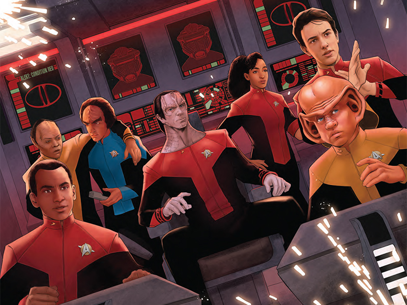
It’s never a good time when a Q decides to teach a cryptic lesson, something a new generation is vividly learning in Star Trek: Sons Of Star Trek #2. Big heavy yet light visuals bring such bold and superb life to a story which tackles the sci-fi and personal exploration with expert care.
Overall
9/10Sometimes our minds allow us to be haunted by past choices. Other times it’s instigated by a lonely young god. Toe-may-toe, toe-mah-toe, really.

Time loops assuredly aren’t fun, but they might pertain the path to healing, or damnation, within Star Trek: Sons Of Star Trek #2. This Breentastic issue comes from Morgan Hampton, Angel Hernandez, Nick Filardi, and Clayton Cowles.
This might be the best Alexander focused story that has ever come out of Star Trek.
That’s a bold declaration, seeing as there have been so few stories that even gave the young Klingon and Human son of Worf a focus. It’s a statement that I stand wholeheartedly behind though.

Hampton has a solid handle on this character, and all the rest that pops up here. Even giving some of them deeper character beats or moments than they got on their respective shows. Being alternate universe versions really helps in some cases, especially for the likes of Dukat or Tuvix.
Father & son relationships are something that Hampton does well, as evidenced by his recent Cyborg series for DC Comics (which I thoroughly loved). It carries over here, three-fold since we have three sons dealing with things related to their fathers and futures. Yet, it loses none of the wacky but powerful beats that make Trek what it has been for all these decades.
A story with this type of hook only works for so long when the character work is top notch. Otherwise, it becomes a moment where the audience just wants to get to the resolution or twist. Balancing the action and the exploratory nature of the story has to be precise, and so far, the formula is working out well.

Reaching that same balance is the artwork, which has even more to really deliver. Hernandez and Filardi fill the order and make the delivery with the precision of Jadzia pulling off the Curzon Maneuver.
So much depth and detail is apparent in the work that Hernandez brings to the page. Emotions are crystal clear with the facial expressions and body language being spot on. Each action sequence crackles with energy and feels almost impossibly bigger than the pages, ready to burst right into reality. At the same time, when it benefits the story all that detail is pulled back on to really focus on a singular element or to set the stage (in some of the more crowded panels).
This move takes nothing away from the story, only makes it stronger because it keeps things streamlined until it all bursts forward again.

Heaviness takes over various portions of the color palette, matching the heavier darker tone of many story beats. Breaking that up are the vividly bright colors afforded to the Starfleet uniforms, various aspects of the ship interiors, and space elements themselves. Mixing in the shadows and more natural colors allows Filardi to create the right atmosphere for the story (even in the atmosphere less vacuum of space).
One thing that really sticks out to me in the various Trek books lately is the choice to have different lighting and filters throughout the main ships. On a show we get why the lights would be the same through almost every space, because of limitations but also ease for shooting. Comics don’t have those limitations and it makes so much sense that different areas of the ship have their own visual aesthetic. Sure, it’s not really a space military-esque program sort of concern, but it’s just a fun visual and makes these ships feel more lived in and unique.
If there is one thing that can be counted on with Cowles on lettering, it’s going to be so visually fun and dynamic. There are more things that can be counted on of course, but that is a major one. From the big actually red bubbled and texted red alert calls to the personalized caption boxes, and more. It all brings a light but important energy to the pages. Giving characters their own sort of personality and power on the page.

While other minor to major modifications allows the lettering to have even more punch. Hitting the tone and volume with gusto, making sure that if a character’s voice is known (thanks to their live-action appearances) it really resonates within our minds. Then even if they don’t have an actual real-world voice, we’re still hearing it clearly.
Star Trek: Sons Of Star Trek #2 is now available from IDW Publishing.
