
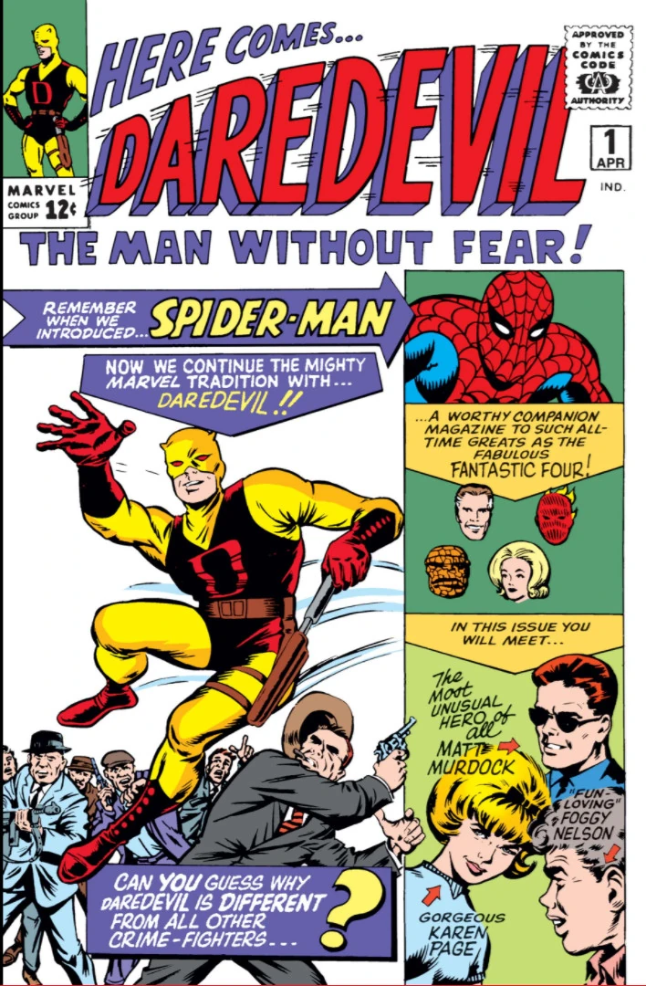
Daredevil Month: Ranking Every ‘Daredevil’ #1 Cover
by Austin Gorton
Once upon a time, #1 issues were rare. In the old days, publishers believed readers were more likely to take a chance on a book if it had a large number, proving its staying power. Whenever possible, launches of new directions or characters would just continue on another series’ numbering (which is why, for example, when Captain America received a solo book again in the 1960s, he didn’t get a new #1 but rather “took over” the numbering of Tales of Suspense with issue #100).
Today, the superhero comic book market thrives on relaunching series constantly to get that sweet first issue sales bump (thanks, Direct Market!). As a result, the number of characters with a half dozen (or more) different #1 issues under their belts is sky high. Daredevil is no exception, and in the spirit of ranking every Daredevil trading card, here’s a ranking of every Daredevil #1 released (so far…)
#8 — Daredevil Vol. 5 #1 by Ron Garney (2015)
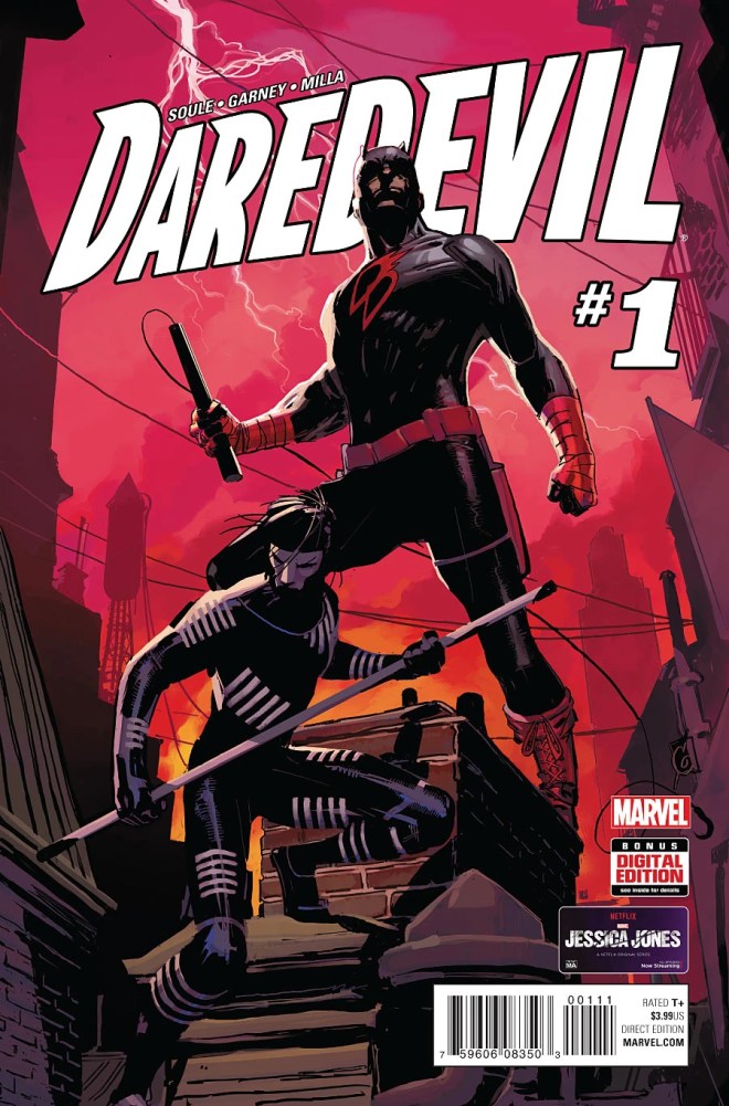
Not a bad cover, but a fairly generic one, with Daredevil just standing there in Stock Heroic Pose. Neither his heightened senses nor his agility or fighting ability are highlighted. Plus, he’s sharing the cover with Blindspot, a character I’m sure we all remember.
#7 — Daredevil Vol. 8 #1 by John Romita Jr. (2023)
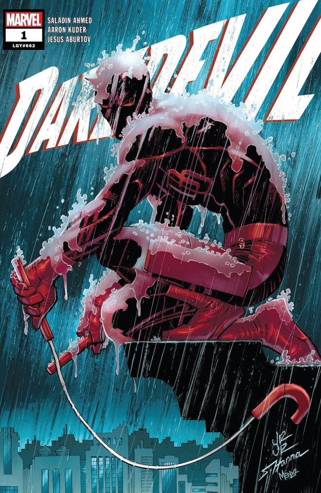
This is the first issue of the current volume. It is one of two covers to feature a general approach of “Sadboi on a building in the rain.” I’m a big John Romita Jr. fan, but this is the more generic of the two such covers.
#6 — Daredevil Vol. 1 #1 by Jack Kirby (1964)
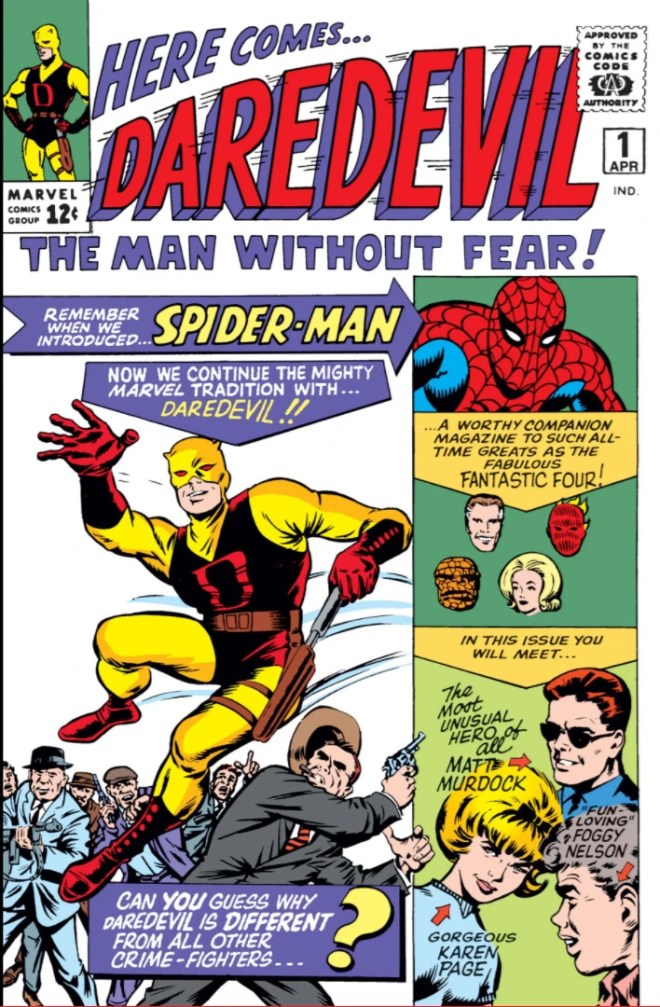
Far be it from me to disparage the King, but this is not one of his finest efforts. There’s a lot about it that almost immediately suggests Daredevil is a second-tier character trying to piggyback off the success of similar, earlier characters (which is true: Daredevil was created more or less because publisher Martin Goodman told Stan Lee to make another Spider-Man): the layout is similar to Iron Man’s introduction in Tales of Suspense #39 (being constructed more like an interior page with panels) and both Spider-Man and the Fantastic Four are put on the cover — explicitly saying, “hey kids, you like those characters so you’ll like this one!”
It gets points for being the first, a Jack Kirby joint, and the only cover to feature Daredevil’s original yellow suit, but it’s hardly an iconic Silver Age masterpiece.
#5 — Daredevil Vol. 7 #1 by Marco Checchetto (2022)
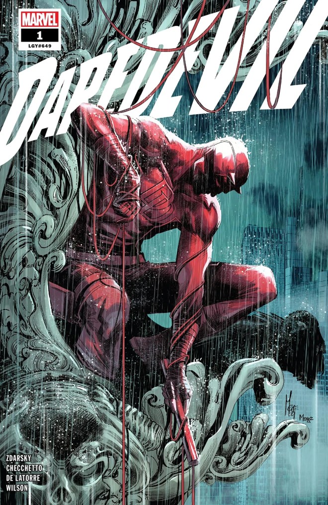
The other “Sadboi on a building in the rain” (and, hilariously, that trope was used on consecutive first issues), this one gets the nod over the other for the way the more intricate masonry (presumably from a cathedral) is enveloping DD — almost like it’s devouring him, just like how the character is constantly on the verge of being consumed by Catholic guilt.
#4 — Daredevil Vol. 3 #1 by Paolo Rivera (2011)
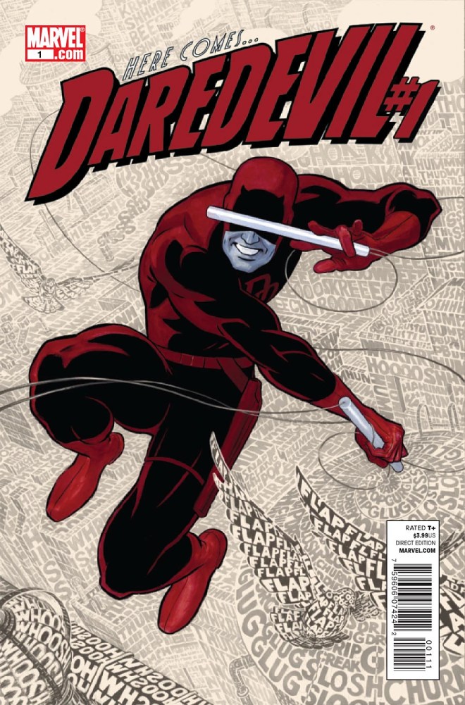
There’s a lot to like on this cover. The way the cityscape in the background is defined by sound effects is a great depiction of how DD’s powers work. The placement of one of the Billy club sections over the eyes to underscore the character’s blindness, the grin that hearkens back to the character’s debut and the dichotomy between “angsty Catholic” Matt Murdock and “carefree vigilante” Daredevil.
But I’ve also always been put off by the blue tinge to the Billy club and exposed mouth/nose/chin. It gives the whole thing an unfinished feel, like it went to press before the colorist finished doing their thing. It’s a nitpick, but one I struggle to get past.
#3 — Daredevil Vol. 6 #1 by Julian Tedesco (2019)
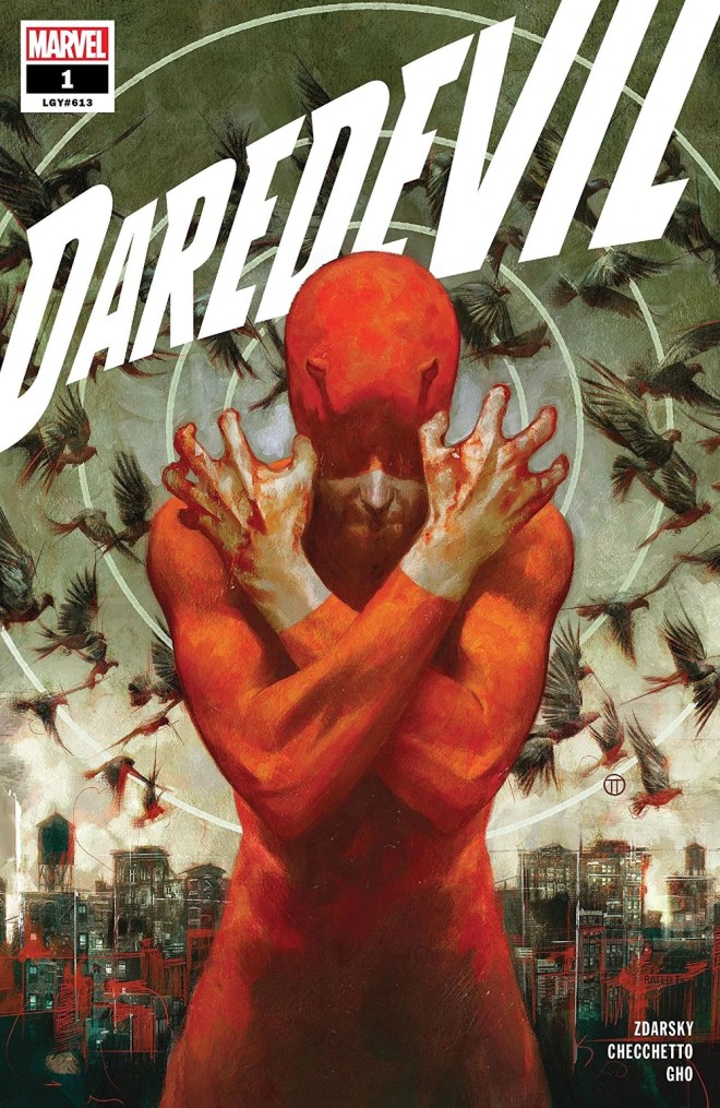
There’s almost an art deco or ’30s propaganda poster vibe to this, using iconography to tell its story. The cityscape in the background and the way Daredevil is positioned like a threshold guardian to it. The blood on his hands, the way the mask covers the eyes, the “radar rings” emanating out from his head. Even with the flock of birds, it’s a very static image, but an impactful one.
#2 — Daredevil Vol. 4 #1 by Chris Samnee (2014)
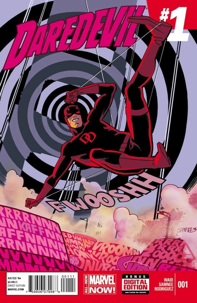
Almost the polar opposite of the Vol. 6 cover, this one is noisy and kinetic. It synthesizes the best elements from the Vol. 3 cover — the “sound effects as objects” routine, the grin, the sense of movement afforded by the rope — and ditches the coloring issues while adding an eye-catching bullseye effect that draws attention to the main figure, centering it as the “loudest” element amongst all the visual “noise” on the rest of the cover.
#1 — Daredevil Vol. 2 #1 by Joe Quesada (1998)
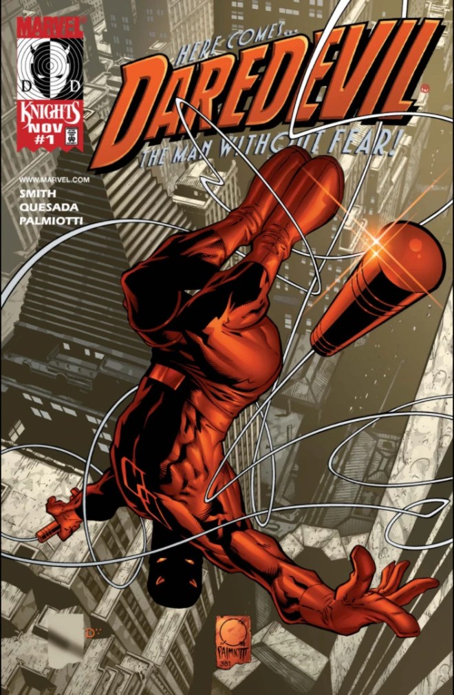
The first “new #1” for Daredevil and the kickoff to Marvel’s late ’90s Marvel Knights imprint that injected a new kind of creative sensibility to Marvel coming out of their bankruptcy, which ultimately led to Joe Quesada‘s long 2000s reign as editor-in-chief at Marvel. His cover is detailed, dynamic, and well-constructed.
The “lens flare” on and perspective of the Billy club draw the viewers’ eyes down to the figure, while the upside down placement speaks to the Daredevil’s agility and daredevil-ness. Once again, the swirling lines of rope, like Spider-Man’s webs, create a sense of movement. And casting Daredevil’s face in shadow with the eyes glowing red is another evocation of the dichotomy that defines the character. Even as he swirls and twirls high above the city like a circus daredevil, there is a darkness inside anchoring that outward whimsy. The end result is a cover which keeps all the key elements to a Daredevil cover in balance while being — first and foremost — an arresting, eye-catching image.

