Devourer Of Cards: Ranking The Best Galactus Trading Cards
by Austin Gorton
In honor of Fantastic Four: First Steps and its planet-devouring Big Bad, let’s do another ranking of trading cards, this time featuring all the appearances of Galactus in notable sets from the heyday of comic book trading cards, the 1990s!

#11 – Marvel Masterpieces Series 4 (1995)

Skewed perspective (the hands look like they belong to someone else), the planetoid looks like a bowling ball, and whether it’s being used or not, it looks too much like bac mid 90s CGI effects.
#10 – Marvel Universe Series 3 (1992)

Like the previous card, the perspective throws this off. Galactus looks like he has a stretchy arm, and his hand is more the focal point than the rest of the figure.
#9 – Marvel vs. DC (1995)

More bad CGI, but the general premise of depicting Galactus sucking power from some kind of planetary object (a recurring theme of these cards) is getting better.
#8 – Marvel Masterpieces Series 4 (1995)

A decent riff on the “planetoid” approach with some good coloring/lighting effects, though it could probably stand to be zoomed out a titch or two more; it feels a little cramped.
#7 – Marvel Masterpieces Series 4 (1995)

The first in another approach to doing Galactus in card form: the “let’s sell the scale of the character by zooming in and having him dominate the frame, leaving the majority of his body off-panel.” This one is a bit effects-heavy.
#6 – Marvel Universe Series 4 (1993)

This is the more traditional rendering of the “zoomed in” approach. It’s lost in this image, but because Marvel Universe Series 4 presented each card as 1/9 of a larger shared image, Galactus extends past this one card to appear in the five cards to the sides and below him, which really sells his scale.

But, that’s the catch of these Series 4 card: the actual Galactus card is much more limited. So it doesn’t rank as high.
#5 – Onslaught (1996)

Just ahead of his “return” to Marvel as part of “Heroes Reborn”, Jim Lee did a few cards in this set of cards dedicated to the linewide “Onslaught” crossover. Lee is perhaps at his best doing trading cards (and/or covers), and he turns a combo “planetoid”/”zoom in” card that gets some points for tossing in a little Kirby Crackle, but loses some points for getting a bit washed out by all the shades of purple.
#4 – Marvel Universe Series 1 (1990)

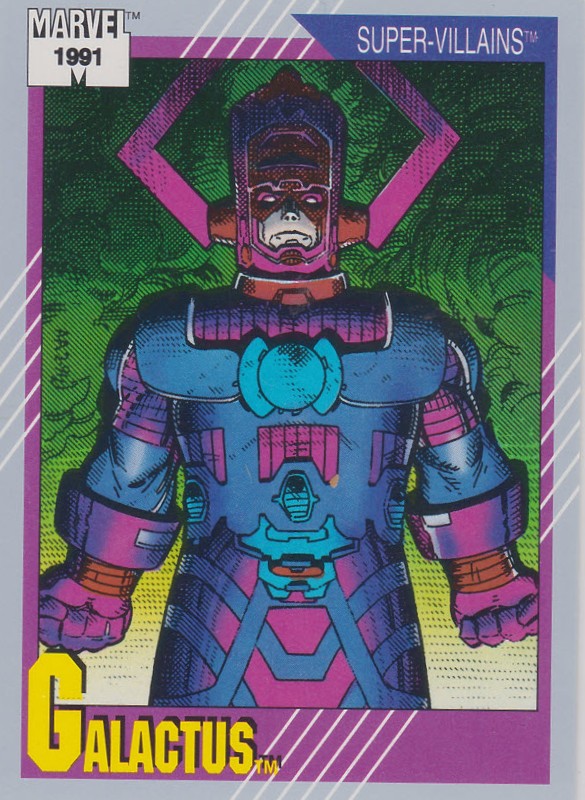
The first Marvel Universe Galactus card goes for scale by positioning the “camera” down, looking up at Galactus, but it could benefit from an additional element to establish scale (as is, its only our knowledge that Galactus is huge that tells us he’s any larger than any other dynamically-rendered character on a card). Points though for surrounding him with cosmic Kirby Tech but still making the character pop.
#3 – Marvel Universe Series 2 (1991)

Like Lee, Art Adams is an exceptional trading card artist, and he takes a “less is more” approach with this definitive “zoomed in” card. There’s something about the slightly chonky Galactus that sells the idea of his determination and longevity, with the billowing smoke illuminated by a warm light below creating the impression of a planet being destroyed.
#2 – Marvel Masterpieces Series 2

One of the few cards to depict Galactus wrecking shit instead of just implying, it’s the little aliens running in terror on the bottom left of the card that makes this one. Yet ironically, they’re also what keeps it out of the top spot, as they make the image feel less like a standalone trading card and more like a one page story.
#1 – Marvel Masterpieces Series 3 (1994)

A little bit “zoom in”, a little bit “planetoid”, the Hildebrandt Brothers claim the top spot with a card that also speaks to Galactus as a cosmic being. The perspective on the hands is just right, the expression on Galactus’ face is packed with character, and the balancing of light sources, from the blue light behind him to the orange light in front, is impressive. All in all, it’s a card that screams “Galactus.”