
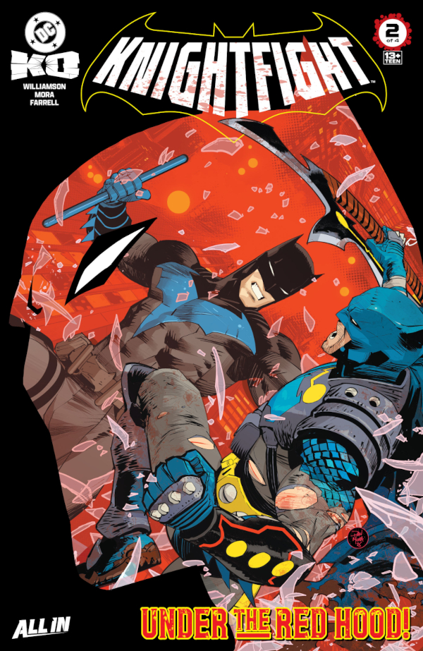
From Apokolips Heart With Love — Reviewing ‘DC K.O.: Knightfight’ #2
by Scott Redmond
Summary
I love how DC K.O.: Knightfight #2 just goes full throttle and doesn’t spend a bunch of time just trying to build things up. It hits the points of what is happening and lets Batman and Batman go at it.
Overall
9/10Batman is known as the guy who tries to think twenty steps ahead and be prepared for whatever happens. When it came time for the big tournament, the Dark Knight thought he was oh-so-clever with his hidden Mother Box technology.
As DC K.O.: Knightfight #2 showcases, the Heart of Apokolips has no love for those who try to game the system. It’s an emotionally frightful journey continues under the care of Joshua Williamson, Dan Mora, Triona Farrell, and Tom Napolitano.

What’s a good formula for a comic book? Letting Mora loose to draw the absolute sh*t out of it.
There is a reason this man is in high demand and has been tapped for a ton at DC Comics in recent years. Instantly, that artwork feels familiar and bold; dense and slick as can be. It’s full of true life and elements that one can’t even put their finger on. It screams superhero in the most loud and obvious way while subtly being something that isn’t quite a true house style. It has an entire energy and existence behind it that defies other styles and stands tall.
Fluidity of movement is felt right away in the sequences that demand a moment of action. Just that spread of Nightwing-Batman and Batman battling it out is so delicious. It’s grand and epic, even as the figures are somewhat blurred and less defined in the backdrop. The focus is on how they move, what they are doing, and the impact of it all with the combatants grappling front and center.

There is a visual switch half-way through when the world and the antagonist for Batman shift. Mora’s work moves ever so gradually to drop some of the elements and allow the grittier sequence to play out with the Red Hood Batman.
Simultaneously, the coloring takes a dramatic turn that really highlights the differences in former Robins in the starkest manner. Farrell does a tremendous job at delivering two completely different yet complementary color palette styles. Softer blues and purples match Nightwing’s aesthetic along with the night and rain of the moment. It really lets the world feel brighter even as the Nightwing-Batman holds the city in such a tight grip.
On the other hand, the Red Hood pages are so dramatically sharp they might cut someone. A more gray hue dominates the space as the other color at the forefront is a powerful blood-red. It really focuses on the morally gray realms Jason Todd spends much of his existence mired within. The results give both spaces and variations their own unique signature looks.

Emotional energy is burning through this story. Bruce confronts his worst fears, and the fall of his sons brings out a lot in the moment. All of it is so clear within the visuals, and even more so in the lettering. Napolitano sinks every bit of emotional resonance into each letter, leaving them soaked and ready to pop. All the fonts shift in subtle and less subtle ways to let the volume and tone wash over the reader. Sounds of the world just pop on every level with power and effect.
Williamson is cooking with fire in this series, after leaving me scratching my head just a bit in the first one. It all comes together here as we learn how Batman’s preparation backfired on him. Instead of being in a different universe, he’s stuck deep in the heart of Apokolips. It’s such a nice little twist and it really works as these different Robins becoming Batman. Most of them would never do that in reality, but in Bruce’s mind and fears they sure can.

I love how this just goes full throttle and doesn’t spend a bunch of time trying to build things up. It hits the points of what is happening and lets Batman and Batman go at it. Bruce’s thoughts are enough to keep us primed on what is happening. They make sense for a mind like his to be laying it all out that way, never detracting from what’s happening on the page.
All of this plays well off the notion of Bruce as a father. Seeing him actually knowing and acknowledging what his kids can do always works for me. The lone wolf operator that pushes everyone away is tired. What’s wired is good dad Batman who just wants the best out of the horde of kids he’s taken under his bat cape shaped wing.
DC K.O.: Knightfight #2 is now available from DC Comics.

