
Daredevil Day: Every Kingpin Trading Card Ranked From Worst To Best
by Austin Gorton
Having previously ranked every Daredevil trading card (“every” being “every card from a major trading card set from the heyday of comic book trading cards aka the 90s), it seems only fair to do the same for his key archenemy, Kingpin. And there’s no better time to do it than the release of the second season of Daredevil: Born Again!
#8 – The Amazing Spider-Man

Art by Mark Bagley
Thanks to his distinctive profile and status as a top tier villain for both Spider-Man and Daredevil, Kingpin has a relatively low floor when it comes to his trading cards as evidenced by this card from Fleer’s first set dedicated entirely to Spider-Man. Not a bad card by any rate, but just a tad less dynamic or iconic than some of the others.
#7 – Marvel Universe Series 1

Art by Ron Frenz
This is in a lot of ways the platonic ideal of a comic book trading card (something which is true of a lot of the first Marvel Universe cards): full-figure shot, medium depth, straight-forward posing presenting the essence of the character. Not bad by any means, but not terribly exciting either. This one gets some extra points for fiery sunset and almost impressionistic skyline in the background.
#6 – Marvel Universe Series 3

Art by Lee Weeks
Depending on when he worked on it, this card was completed either during or just after Weeks’ run on Daredevil, which culminates in “Last Rites” aka the Fall of the Kingpin (a story which serves as a sort of bookend to the Daredevil narrative begun in “Born Again”). Not surprisingly, as a result, Weeks draws a pretty good Kingpin, with the layout of the Series 3 cards – with the figure set against both a larger cosmic background and a smaller inset background panel – helping Weeks’ Kingpin feel especially massive.
#5 – Fleer Ultra Spider-Man

Art by Mark Fredrickson
Fredrickson goes a different way to capture Kingpin’s bulk and power, doing an extreme closeup that fills the frame with Kingpin. While well-rendered, the snarl and flared nostrils are a bit over the top (giving the whole thing some Gru from Despicable Me vibes), keeping it out of the upper echelon of cards.
#4 – Marvel Masterpieces Series 3

Art by Greg & Tim Hildebrandt
The Hildebrandt Brothers turn in another low angle shot to create a sense of bulk by filling the frame with Kingpin, but by zooming out a little relative to the Fredrickson card, they create an overall image that is a little more successful. The falling cash is a nice touch, giving the image a sense of movement and tension as it draws the eye down away from Kingpin’s face.
#3 – Marvel Universe Series 2

Art by Erik Larsen
While not as richly-textured or detailed as the fully-painted cards, Larsen’s Kingpin captures the over-the-top comic book-ness of the character, carrying over the rich orange/red backgrounds of the Series 1 card while going all-on on the size and menace of the character.
#2 – Marvel Masterpieces Series 1

Art by Joe Jusko
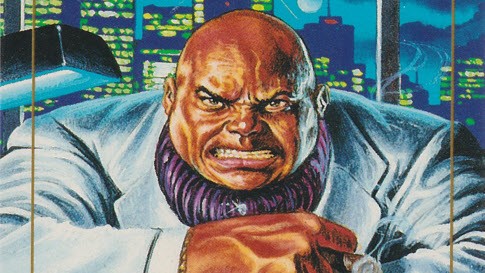
Jusko – who painted every card in this set – goes the “fill the frame” route but turns in a more nuanced, humanistic figure. Centering Kingpin’s massive hands in the frame is a smart choice, creating a sense of power and menace despite the otherwise ordinary – man sits at desk – staging.
#1 – Marvel Masterpieces Series 2

Art by John Romita
Coming from Kingpin’s co-creator, this fully painted card from John Romita not surprisingly leans heavily Silver Age in its depiction of the character. In doing so, it serves as a perfect synthesis of the character’s comic book stylings and the more realistic renditions of the high-end painted cards. Like Jusko, Romita puts the massive fists front and center, with the shattering glass further emphasizing Kingpin’s power while also creating the sensation of movement.

