
Talking ‘A Mischief Of Magpies’ With Simon Spurrier And Matías Bergara
by Rachel Bellwoar
“Is this the real life? Is this just fantasy?”
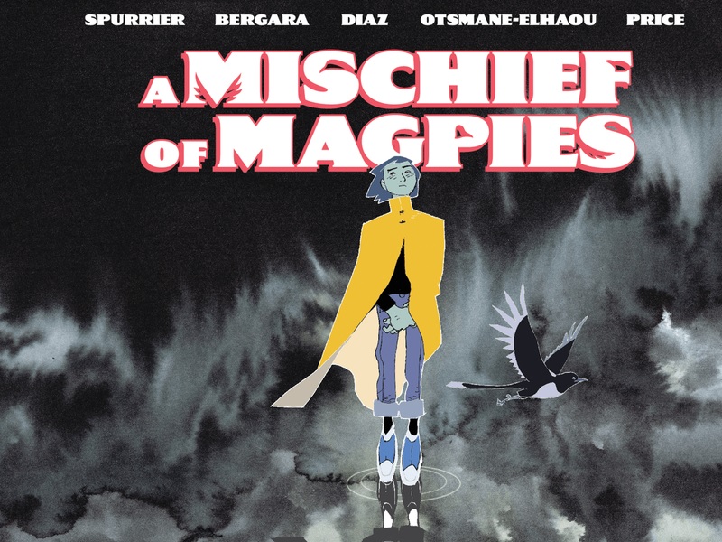
Queen fans will know these lines as the opening lyrics to “Bohemian Rapshody,” but they also mirror the experience of the main character in Simon Spurrier and Matías Bergara‘s new series, A Mischief of Magpies. At home Marinus has a little sister who’s sick and parents who are preoccupied. In his dreams, however, Marinus is being vetted to go on a quest and become a hero… but what if his dreams are real? With colors by Bergara and Kike J. Diaz and letters by Hassan Otsmane-Elhaou, Spurrier and Bergara answered some questions about the series below:

Rachel Bellwoar: Usually getting to know someone by reading their diary would be seen as an invasion of privacy yet that’s exactly how Marinus is introduced in the first issue of A Mischief of Magpies: through diary entries he wrote at different ages. Why did you want to restrict yourself to text when establishing Marinus’ home life and what challenges did that create visually?
Simon Spurrier: Primarily, we wanted to set out our stall early. This isn’t a conventional comic book. It’s a Spurrier/Bergara collaboration, so you know it’s going to push the medium and find interesting ways of telling a story. We decided early on that it would be a fascinating experiment to craft a portal fantasy in which the protagonist’s Real World Life is presented via text, and their sojourns in the fantasy reality are presented via comics. That brings a whole suite of attendant virtues and challenges. In the pros column, a diaristic approach gives us a deeply intimate access into Marinus’s mind and heart, and of course we want to experience the fantasy world via glorious Bergara artwork.
In the challenge column, we recognize there’s a big chunk of comic book readers who will be jolted out of their enjoyment of the experience if they turn the page and smash headlong into a wall of text, whilst in full sequential flow.
So, the book opens very gently and very carefully. We let the reader acclimate to the conceit slowly. We begin with separated text and a lot of visuals. We then enter Mar’s diary when he’s very young, when his words are a crude and highly visual element. Little by little we follow him as he gets older, using gradually maturing handwriting styles, eventually coming to type all his text. At every stage we feather the edges, so there’s no sudden shift from text to comics or vice versa. It’s organic.
What we’re subtly doing here is reassuring the audience. This isn’t just going to be a textual tale, folks. There’s beautiful sequential sequences at every stage. More importantly, we’re teaching them that in this book text is a graphic element. It’s not some glaringly overlaid alien thing to be digested in parallel to the art. It is the art. It’s part of the page. Part of the pace. That’s something we couldn’t have done without our team designer Emma Price putting together every page, managing the transitions, orchestrating the diary text; nor without our letterer Hassan Otsmane-Elhaou handling every dialogue balloon like a key piece of art.
Hopefully, by the time we begin the story proper, when Mar is a teenager on the cusp of a crisis, the reader has relaxed into this unique set of mixed media and is fully absorbed in the story.
Matías Bergara: From a visual standpoint, it meant we had to pre-design or layout the pages carefully before any art was put into place – in a collective effort of the whole team. If this was a typical comic book, I would do the layouts myself using only the script, but this time, there was a lot of lettering, design, and writing decisions that had to be taken in unison. Once I had a clear idea of how and where to place drawings – not always in the form of a comic book panel – I was good to go.
Bellwoar: By contrast, we actually get to see Marinus interact in his maybe dreams, maybe memories of visiting the Wandering City. Do you plan on continuing that pattern in future issues – showing his visits but only telling about his family?
Spurrier: Yes, that’s key. Part of the magic of comics is the way it relies on the reader’s unconscious brain to reconcile elements of perceived information – ie: things that rely on prior knowledge in order to be decoded, like language, text, directional reading conventions, etc – and received information, ie: things that are communicated directly, like imagery. We believe firmly that the more exercised a reader’s brain is, the more invested they are in the emotion of the story. With Magpies, the perfect mix was to allow Matias’s world-class art to invite them into worlds and situations that will feel unfamiliar, exotic, and thrilling, while allowing text to speak to the elements most of them will already relate to: the everyday reality of being an awkward kid.

Bellwoar: What’s it been like establishing the Wandering City as this city of two halves: the half that’s above water but also the half that’s underwater?
Bergara: Simon gave me a pretty detailed description of the city as this sort of gigantic floating machine that is constantly on the move and displacing vast volumes of water along an endless ocean. More of a mechanism than a “place,” so to speak – and thus its workings, inner and outer, were important both to the story and the visuals. There is an important factor to its duality, but more about that will be revealed in the following issues. I found it very fun to illustrate – I have a soft spot for making up weird machinery, colossal structures, and iron things.
Bellwoar: Then there are the people of the Wandering City, who seem to have their own catchphrases like “Go ever on.” Is this simply local lingo or should Marinus be concerned he might be dealing with a cult?
Spurrier: This becomes a very important point in later issues, so I’m keen not to spoil it. But apropos of nothing, it felt like a fascinating glimpse of an alien culture. Their whole society is structured around the concept of progress, movement, momentum. They don’t really care about a destination – they find that idea confusing. In fact, the whole notion of ‘why are we travelling?’ is bewildering to them. What matters is that they are. They live in a city which is a machine, the machine exists in order to work. The idea of not travelling, not going, would be akin to a shattering spiritual crisis for them.
That’s the sort of cultural strangeness that I think elevates an ‘alternate world’ fantasy into something memorable, rather than being just another masturbatory kaleidoscope of elves, dwarves and dragons.

Bellwoar: Then there are the titular magpies. For a series with an aquatic antagonist, one might’ve expected a seabird, like a seagull, to be the featured bird. What made you decide on talking magpies?
Spurrier: They’re just so perfect for the role. Anarchic but loyal, mischievous but philosophical. Clever but crude. You watch a magpie for any length of time, you get the distinct impression they’re having a pretty great time. It’s not just about survival, it’s about enjoying the crap out of life, and not getting hung up on stuff that doesn’t matter. Plus, visually, they’re a useful symbol for being the middleground between two extremes, the light and the dark. In our story, this tribe of birds occupies the liminal space between the obsessive perfectionism of the city and the gloomy melancholy of the magical undercity. Magpies were the only critter for the job.
Bergara: This was originally one of Si’s pitches for a possible species of bird to feature in the story, and there were other marine birds considered – but we ended up choosing the magpies for the characteristically playful, witty ways they have in real life. Also, they are very strikingly feathered in black and white with a blueish sheen.
Bellwoar: Marinus’ blue skin and gills are fairly notable characteristics yet it’s his yellow coat that really glows and pops off the page. What interested you in working with that color?
Bergara: Mar has been probably the main character I have designed the fastest ever in my career. I literally read the early treatment for the story, grabbed a sheet of paper and bam, did it in one take. I have that paper at hand and it shows few if not a single erasure mark on the pencils. I don’t know why it came out that way. It just appeared in my mind in a second, colors and all, and I didn’t think twice. Yellow is a color I really love and always try to sneak in a little bit here and there. It also works very nicely and reliably in print as a “light” source, so to speak. The other muted colors of Mar are for contrast.

Bellwoar: What are you most excited to see readers respond to with regards to A Mischief of Magpies?
Spurrier: I think people will talk a lot about the formalist experimentation, which has become one of the calling cards of mine and Matias’s collaborations. And that’s cool, we’re very happy to be known for our enthusiasm for pushing the medium. But I’m pretty sure, once the novelty of that is out the way, we’re going to hear a lot about how moving a tale we’ve spun. All the smartass medium-pushing stuff isn’t worth a tinker’s toss if it’s not actually doing something useful. In this case, the hope is the confident expectation that it’s helping Mar Picknett find a space inside our readers’ minds and hearts. His tale takes some unexpectedly dark turns. We’re excited to bring readers on his journey, with its crashing lows and stratospheric highs.
Bergara: I would say the story and visuals should strike a chord deep inside the readers’ sense of relatability and awe for things both fabulous and painful, and for things that are not easily defined within ourselves. It’s a bittersweet story of what goes on inside of us and how deep our inner reaches really are. I would not ask of any reader a specific response – this story is more of an open question than a demand for answers, and I hope we can also entertain the capacity for wonder of everyone during the reading. And after.

Bellwoar: Thanks for agreeing to this interview, Simon and Matías!
A Mischief of Magpies #1 is on sale now from DSTLRY.
